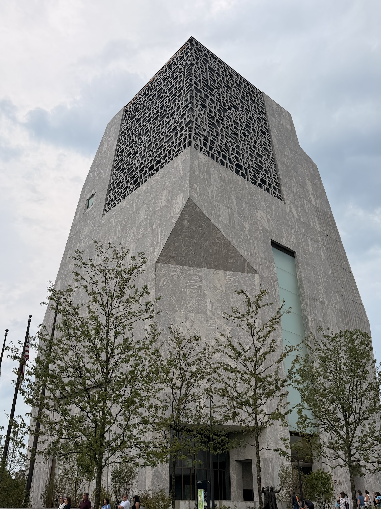
Look up at the corner of the tower. Way up, near the top, wrapping around from one face to the other — those are letters. Concrete ones. Four feet four inches tall apiece, four hundred and fifty-eight of them, spelling out a hundred and three words.
Part of what it says is this. The single most powerful word in our democracy is the word we.
The designers called the whole installation Words of Hope, and the shape of the letters is worth knowing about. It's a typeface called Gotham — the exact font from the two thousand eight campaign. Every poster, every yard sign, every rally banner. They took the font off the merchandise and blew it up to the typographic equivalent of five thousand three hundred and fifty point, and hung it on the side of a building.
Gotham, by the way, was originally commissioned by a men's fashion magazine. That's where it comes from. G-Q wanted a masculine, straightforward sans serif in the year two thousand, and twenty-six years later it's carved into the top o
f a presidential center.
Now the part that nearly stopped the whole thing.
You can't sculpt letters that size out of stone — too heavy, too slow, too likely to crack. So a company called Fine Concrete built what they described as the world's largest letterpress. They programmed a six-axis robot to rout each letterform, then cast the letters in ultra-high-performance concrete shot through with ha